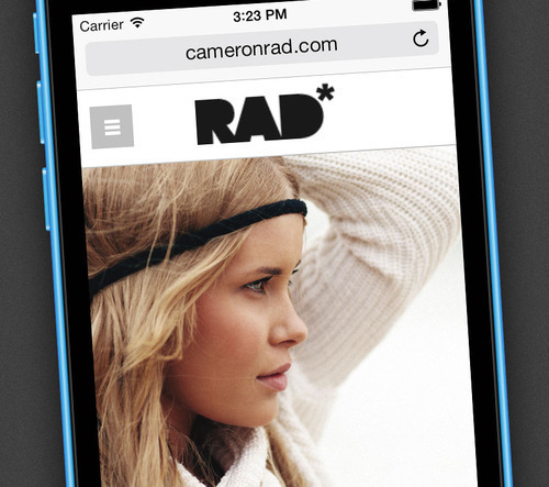
New Mobile Websites

We just recently launched all new, and much-improved mobile-optimized websites for everyone. They’re much better than our previous mobile sites in basically every way, and we think they’ll prove to be a much more unique, customizable, and efficient experience for your site’s mobile visitors.
(Mobile-optimized sites are available via the “Add-ons” section in your control panel.)
Logos
Now your mobile site will use the same logo as your main website does, automatically. No more need to upload special mobile files and write custom CSS.
Automatic Design Inheriting
Along with the new logo feature, your mobile site will now inherit the overall design from your main website automatically. Fonts, colors, etc will automatically match the rest of your website, providing a much more unique look to your mobile website than before, and without any extra work!
More Efficient Navigation
Now every page has a full “hamburger button” navigation bar, so visitors can navigate to any page, from anywhere, without needing to first go back to the home page. This saves valuable time and bandwidth for mobile visitors.
Image Download Blocker
If you have our image download blocker add-on enabled, it will now also work on your mobile site as well.
Better Use of Real Estate
Mobile devices obviously have limited screen space, so we’ve made small adjustments to allow your images to be displayed as large as possible, eliminating borders where it’s practical.